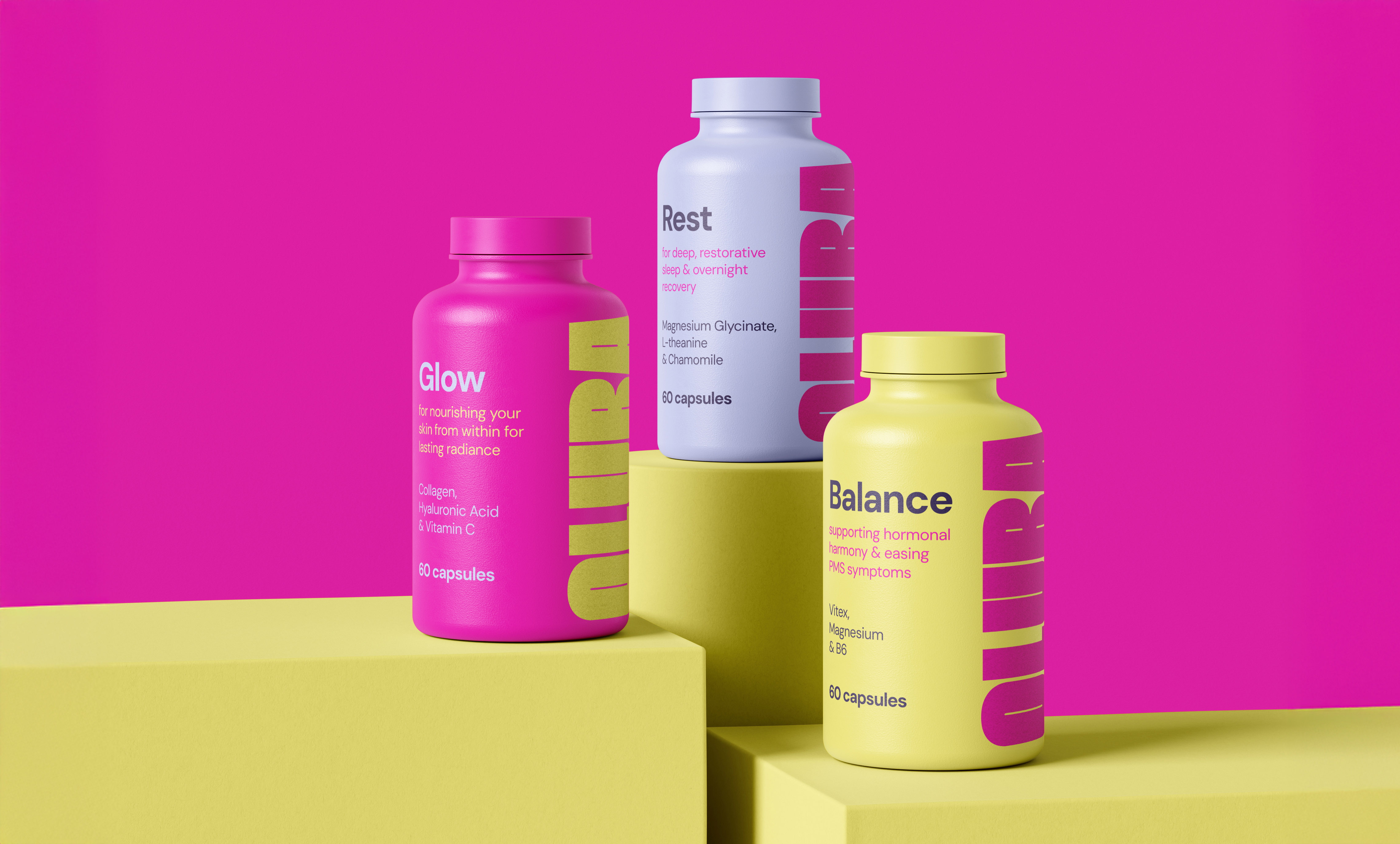
OLURA
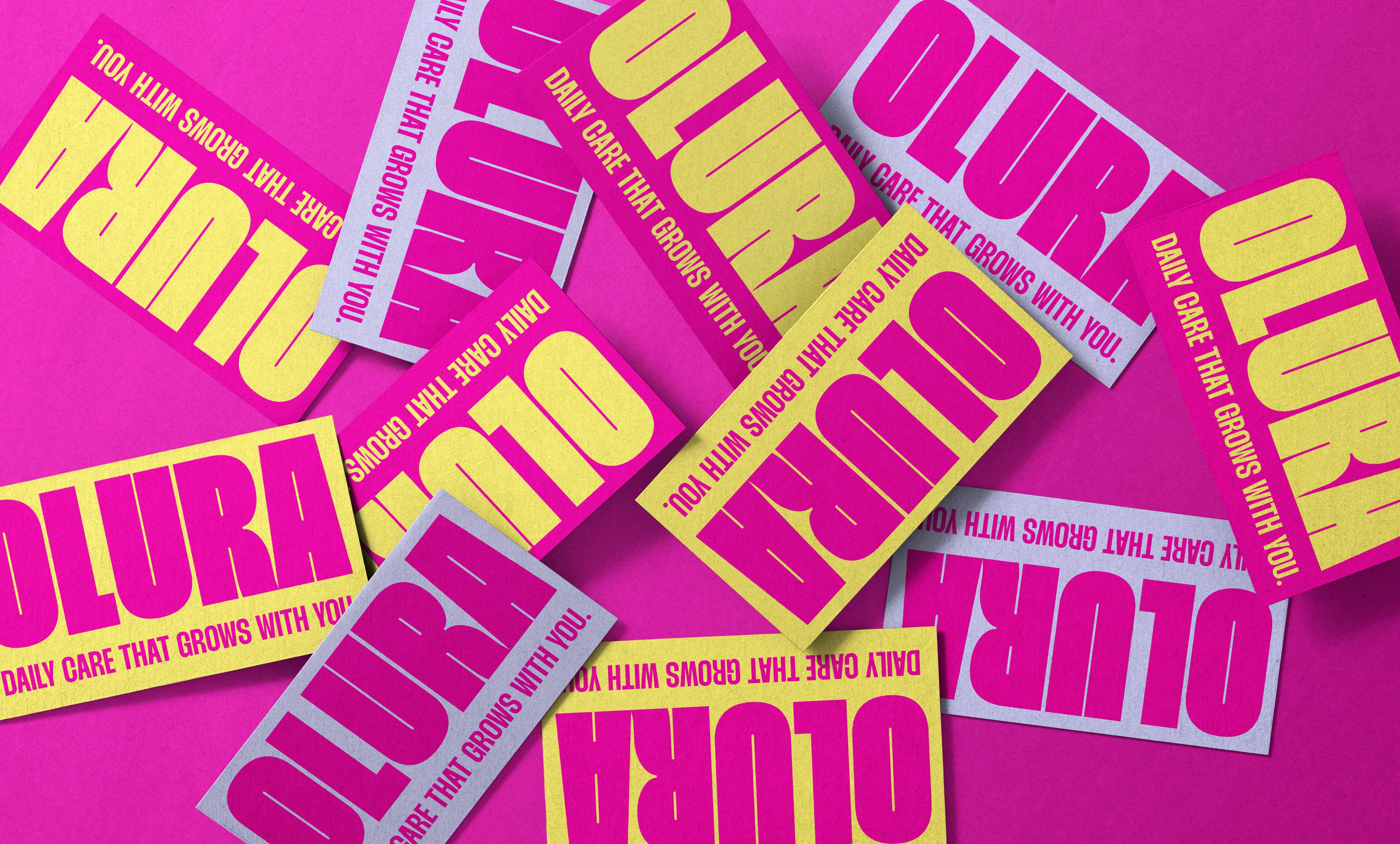
Brand Identity
Packaging
Olura is a supplement brand designed to grow with women through every change their bodies experience. Using simple, clean ingredients, it focuses on supporting skin, hormones, and overall balance, helping women feel their best, inside and out.
The goal of this project was to show the confidence and boldness of the brand through its new visual identity. I chose a strong, sturdy typeface to represent the support Olura gives to young women and paired it with a bright colour palette of pink, yellow, and baby blue to celebrate femininity and reflect the radiant energy women feel when taking the supplements. This sense of radiance also comes through in the photography direction. To emphasise the clean and simple ingredients, I kept the packaging minimal and straightforward. Together, these elements created an identity that expresses the energy, clarity, and confidence at the heart of Olura.